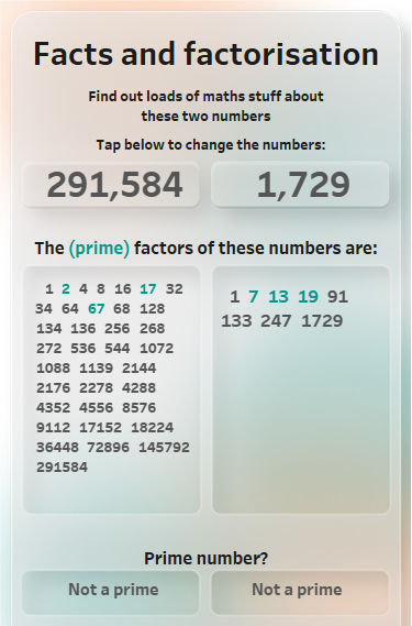
Fun with factors, primes and sets
Congratulations if you managed to get past the title! That means that you have at least a passing interest in mathematics. I don’t know where the idea came from, but I thought it would be a nice exercise to work out the prime factors of numbers using sets in Tableau. I had also wanted to experiment with designing for mobile and modern UI trends, so I brought all these ideas together into one dashboard. You can see it here. Techniques…